Therapists understand that when they go into private practice, they will need a way to attract new clients. Getting a small business off the ground, often with a limited budget, can be challenging when there are a number of up front costs. Affording a professional looking website may seem out of reach, but it’s the best way to find those new clients, if it’s done correctly. I’d like to share a few counseling website design tips and best practices for counseling websites based on my experience helping therapists, social workers, and therapy practices turn their practices into a thriving ones.
1. Don’t follow a standard marketing plan for just any small business
Most small businesses aren’t concerned with privacy in the same way that counselors need to be. When a potential client visits your website, they want to know that you are concerned with their privacy. While social media can be good for other types of small businesses, it often isn’t a good idea for yours because it can give the subtle impression that you are interested in sharing things publicly about your practice. If you have specific mental health tips you’d like to share, it’s best to do this on your blog which will also help with your search engine presence.
2. Capture your therapy style, experience and uniqueness
Therapists aren’t known for being sales people and often feel uncomfortable promoting themselves. One of the biggest mistakes you can make is selecting a cookie cutter template with boiler plate text and images that does not capture your individual style and practice. Potential clients want to know who you are, what skills you have and if you can help them. They want to feel that you are someone that they can connect with and share their most personal thoughts with. If they can’t get a sense of who you are, they will move on to someone else’s website.
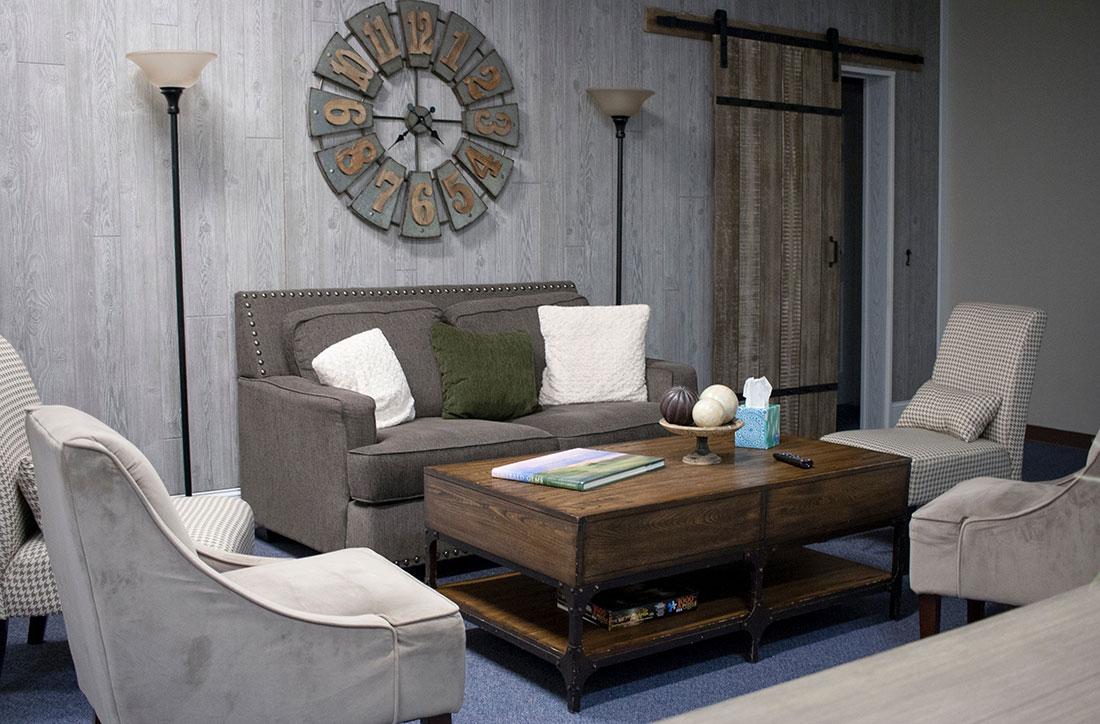
The best way to share who you are and your style is through images. You need to have at least one professional looking photo of you on the website, and preferably on the homepage. It is also nice to share photos of your inviting office space so clients can more easily envision what their surroundings will be like during their sessions.
3. Make sure the design is user friendly and that important info is front and center
Hunting for important information on websites is frustrating. Your office address and contact info needs to be on the homepage as well as an obvious link to your page with your rates and insurance information.
4. Choose a web designer who gets your vision
Being able to successfully communicate with your website designer or developer is important for many good reasons. At the top of the list, is translating your vision into reality. I have had several clients come to me with the complaint that their previous web person just didn’t get their vision. It’s helpful to ask to see a first draft of your homepage before more work is done to ensure the look and feel you are going for is captured. Don’t be afraid to speak up and get detailed about what works and doesn’t work for you.


